GRAM CITY DESIGN SPRINT
Gram City is an app prototype that aims to help users find the most picture worthy places in a city. This includes tourist attractions, architecture, artwork and murals, etc.
The problem:
The company wants location searching to be an accessible feature of the app, not the focus. They also want the app to have a social feature to allow users to share locations with others.
Role:
Run a modified Google Ventures design sprint to test out a possible solution as a solo UX/UI designer quickly. I did research and conducted competitive analysis, created a few mockups of screens, and collected user feedback to see what could be added or improved.
Tools:
Google Docs, Marvel, Figma
DAY 1 - MAPPING
Understand the problem and map the user flow
I drew a mini journey map with two different potential routes that a user would go down when using this new feature. I ended up making changes later to my prototype screens, but these were the initial routes I went with.
In the first route, the user would click the button, see the map, and then type in what they were searching for. This would let the user narrow the search down to specific locations like museums.
The second route is much closer to what my prototype accomplishes, where the user is free to explore the map first, before taking a look at locations for information. Users get a sense of control in that they get free reign to learn what’s in the area, and then can create a list of things to check out from there.
DAY 2 - SKETCHING
Analyze competitors and sketch a solution
I conducted lightning demos on two different apps, in order to see what other competitors are out there, and to gain inspiration for features that I could integrate into my design.
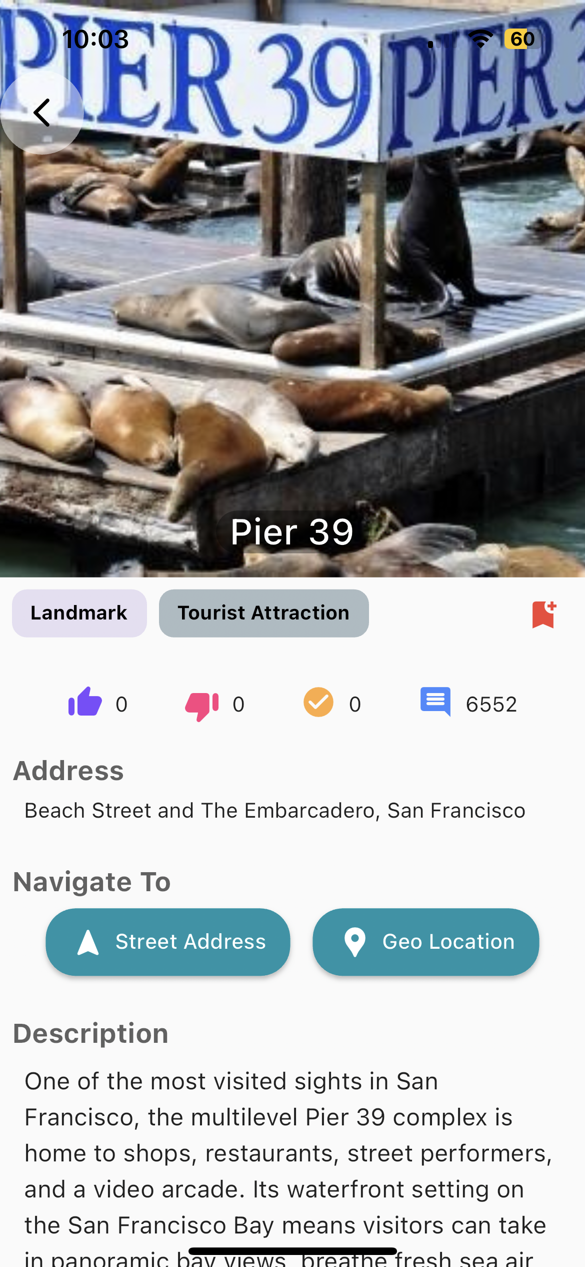
WhatsHere
First, I looked into an app called WhatsHere, which gives you suggestions on nearby attractions.
Pros:
It does its job and gives suggestions on places to check out.
The app layout is simple.
Cons:
The app pulls up images from Google, rather than showing user generated photos.
When clicking the buttons in the “Navigate To” section, the app redirects to Apple Maps.
Roadtrippers
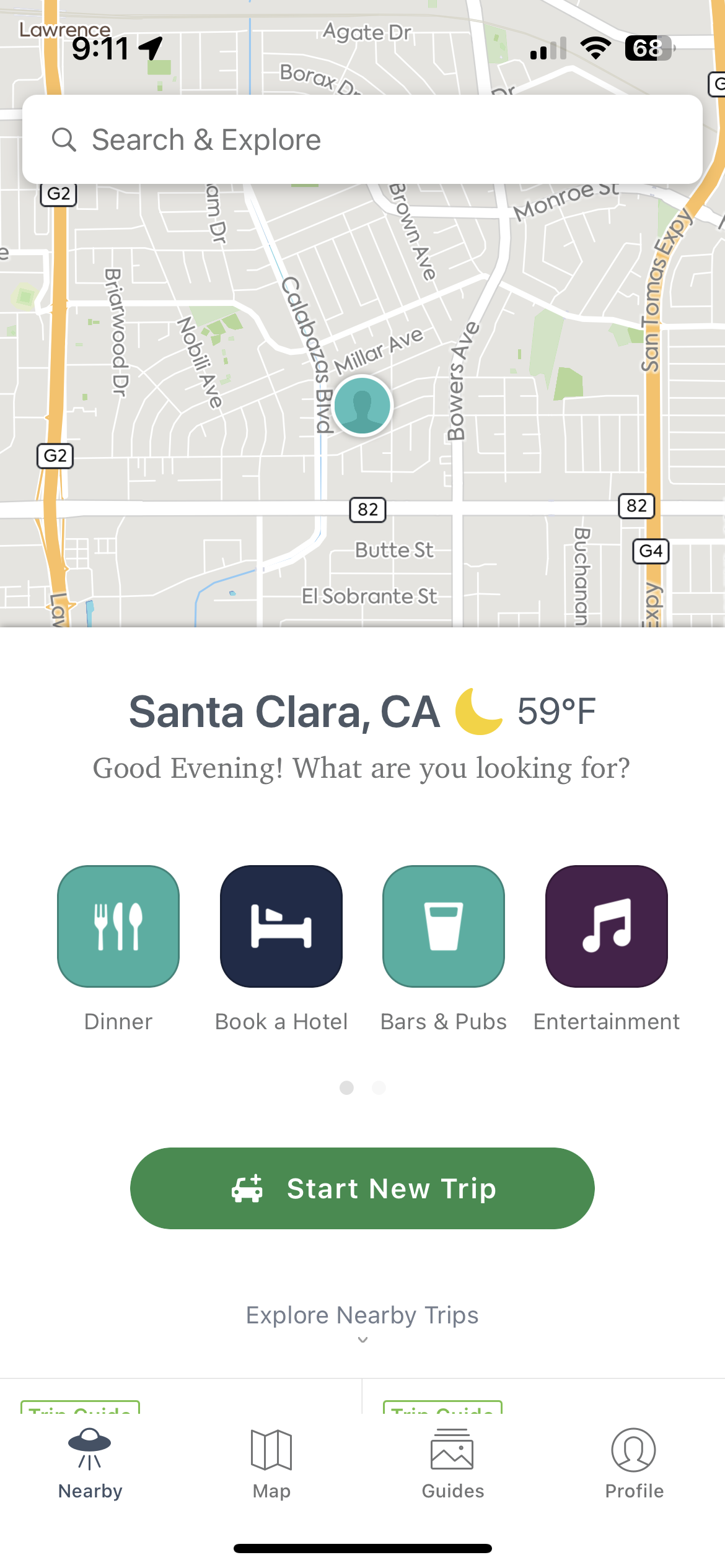
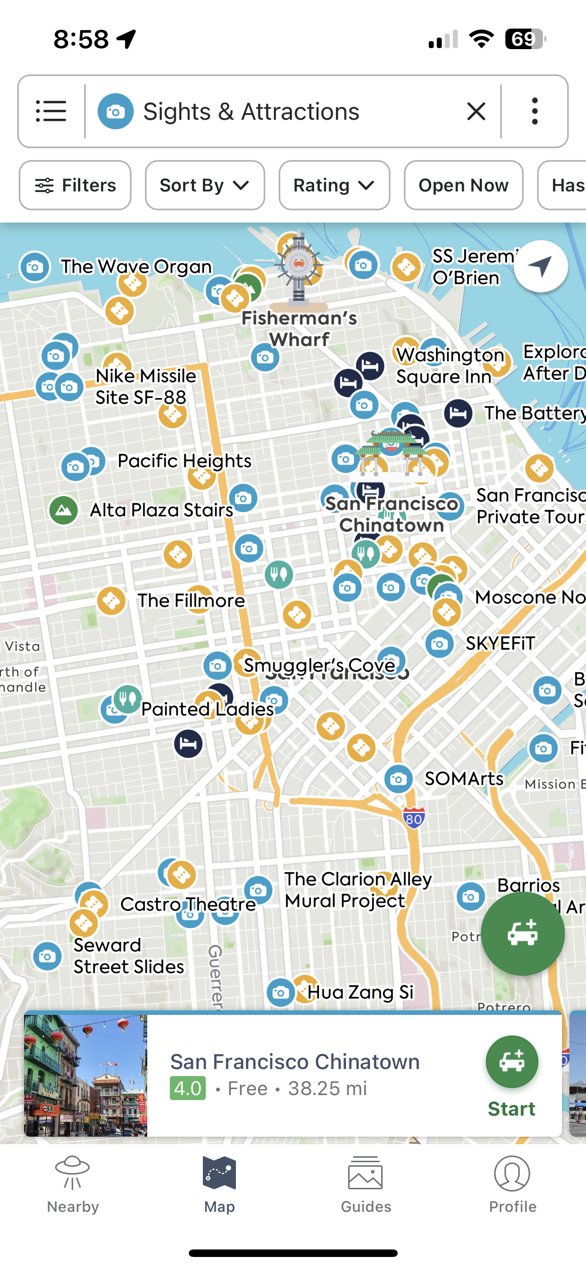
The second app that I looked into is Roadtrippers; this app had a map integrated into it.
Pros:
The app is very direct and immediately asks “What are you looking for?” It even opens with options for the user and has the map ready.
The app’s layout is very nice. The search bar is at the top of the screen, while the drop down menus have search filters.
The app offers immediate navigation to a place as a suggestion at the bottom of the screen.
Cons:
The app has a 2D layout when my goal is to have a 3D map.
The map uses generic icons rather than images of the places.
Sketch the solution
I then did a Crazy 8s exercise and timed myself for 30 minutes. It was my first time doing this, and it was a challenge for me as I consider myself a very detail oriented person.
I spent more time making sure my sketches looked perfect, rather than going through the whole app flow. I sketched a few screens of what the location searching feature would look like.
DAY 3 - DECIDE
Decide and create a storyboard
I then decided to draw my storyboard on some graph paper. Since I didn’t get to fully complete all of my Crazy 8 sketches on day 2, I drew extra screens to reflect the finished process of landmark searching. I used a blue marker to draw the screen and pink to indicate a navigation route.
I went with this route because it combined my two user map routes.
The user, having opened this feature for the first time, looks up places that are nearby, before deciding to exit the menu and explore the map on their own.
DAY 4 - PROTOTYPE
Prototype the solution
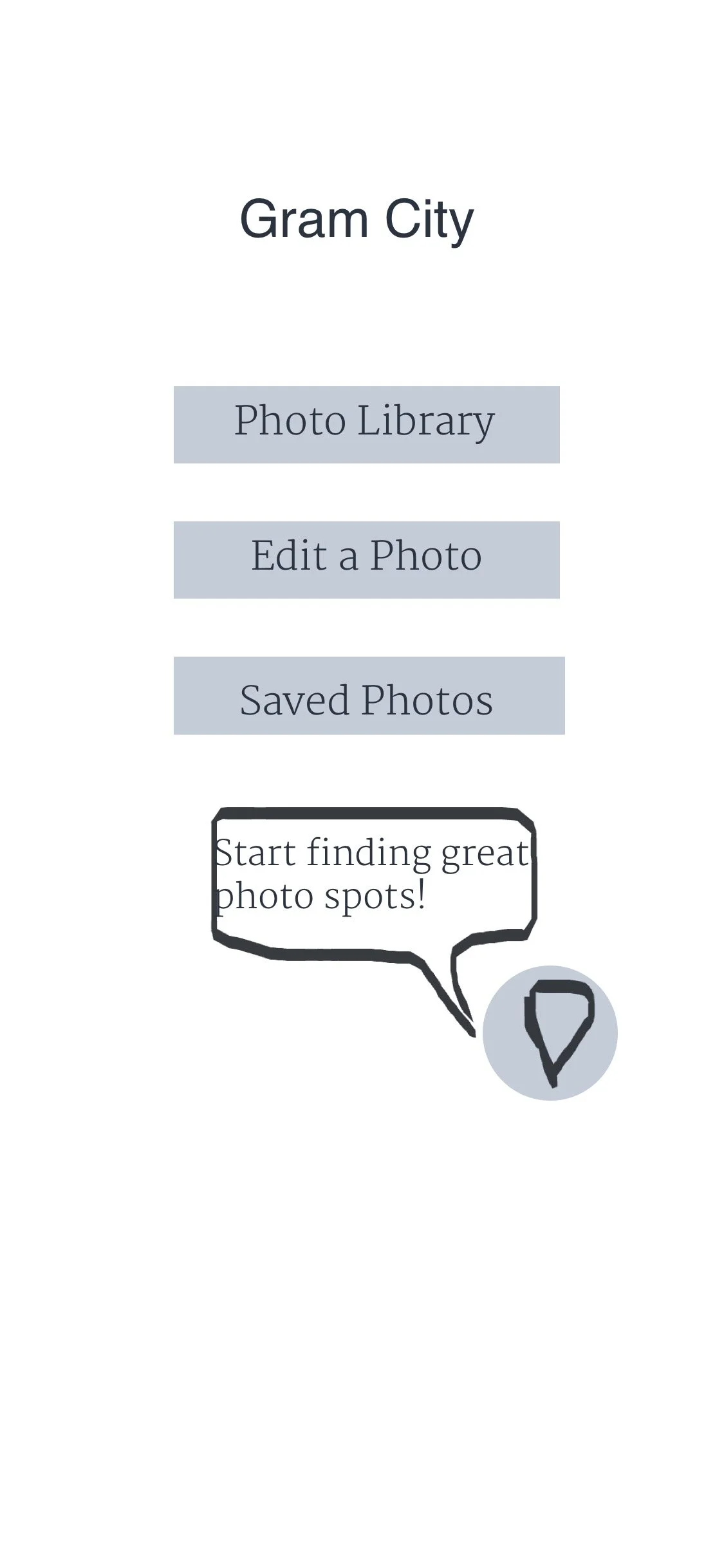
I then created my prototype screens, which are pictured on the right.
I tried my best to make them similar to my sketches and storyboard. When it came to testing, I hoped to learn how efficient the search process was, if the feature was easy to navigate, and overall if users liked the idea and the approach that I’m taking with it.
DAY 5 - TESTING
Finally, I interviewed five people from my church and had them test my intial prototype.
This prototype involved having a user search for museums, exiting the search results, and opting to explore the map on their own.
The app was simple and the interface was straightforward; “consumers like simplicity.”
2 people suggested making the app similar to Pokemon Go, and also compared it to Yelp.
One person said potential users should be able to mark locations on the map for the future. He also said it would be cool to have a map of marked locations that one could share with other people, and brought up the idea of having user avatars.
Another person said that they would want to see other users’ photos when clicking on a location bubble. A star and a user rating could also be on the description for the location bubble.
Users should be able to sort by closest proximity, highest to lowest user ratings, and potentially even wait times.
RESULTS AND TAKEAWAYS
I learned how to use the Design Sprint process to solve key design problems as quickly as possible.
Working on a design sprint for the first time was a very interesting challenge. My first capstone project took me several months to do, which allowed me more time to gather research and make my screens more refined. To have to suddenly condense all of that work into a few days was definitely daunting and a little bit confusing.
As stated before, I consider myself a perfectionist sometimes. Naturally, I want the work I put out to look and feel quality, even though the whole point of design and research is to have a product become more refined and higher quality over time.
For future design sprints, I would probably spend less time perfecting my Crazy 8s, since I can refine the actual interface designs later. I also found that I really like doing research and getting user feedback, so I would most likely reach out to more people to get more input.


