MOOLAH
Description:
Moolah is a finance app prototype that allows users to keep track of their monthly subscriptions.
Users can get notifications about upcoming payments, see an overview of their subscriptions, and pause or cancel any of them if needed.
The problem:
Moolah currently only exists as a desktop website. They want a mobile app created since most of their users prefer to use their phones instead.
They also want the app to be easy to use for users over the age of 30, as well as be accessible to people in Germany since the company plans on expanding there.
Role:
Secondary Research
App Layout and Design
Usability Tests
Tools used:
Figma, POP by Marvel, Miro, Google Docs, Google Sheets
SECONDARY RESEARCH
Since I didn’t do any user interviews for this prototype, I chose to conduct secondary research instead.
According to a CNBC article, I learned that “71% of respondents estimate that they waste more than $50 each month on subscription services”. 2/3rds of consumers admit to forgetting at least one recurring transaction per year.
In another CNBC article, they weighed the pros and cons. Tracking is helpful, but sometimes users still have to pay a subscription just so they can track their other ones. This means having to upgrade to a premium version so they can cancel a service directly through the app, which doesn’t make sense if a user is paying $30 to cancel a $5 subscription.
My research helped me find the 4 main features that users would want: categorization, a monthly report, push notifications, and the ability to cancel a subscription.
COMPETITIVE ANALYSIS
After doing secondary research, I conducted a competitive analysis to see what other apps were out there, but also to gain inspiration for my own designs.
Rocket Money
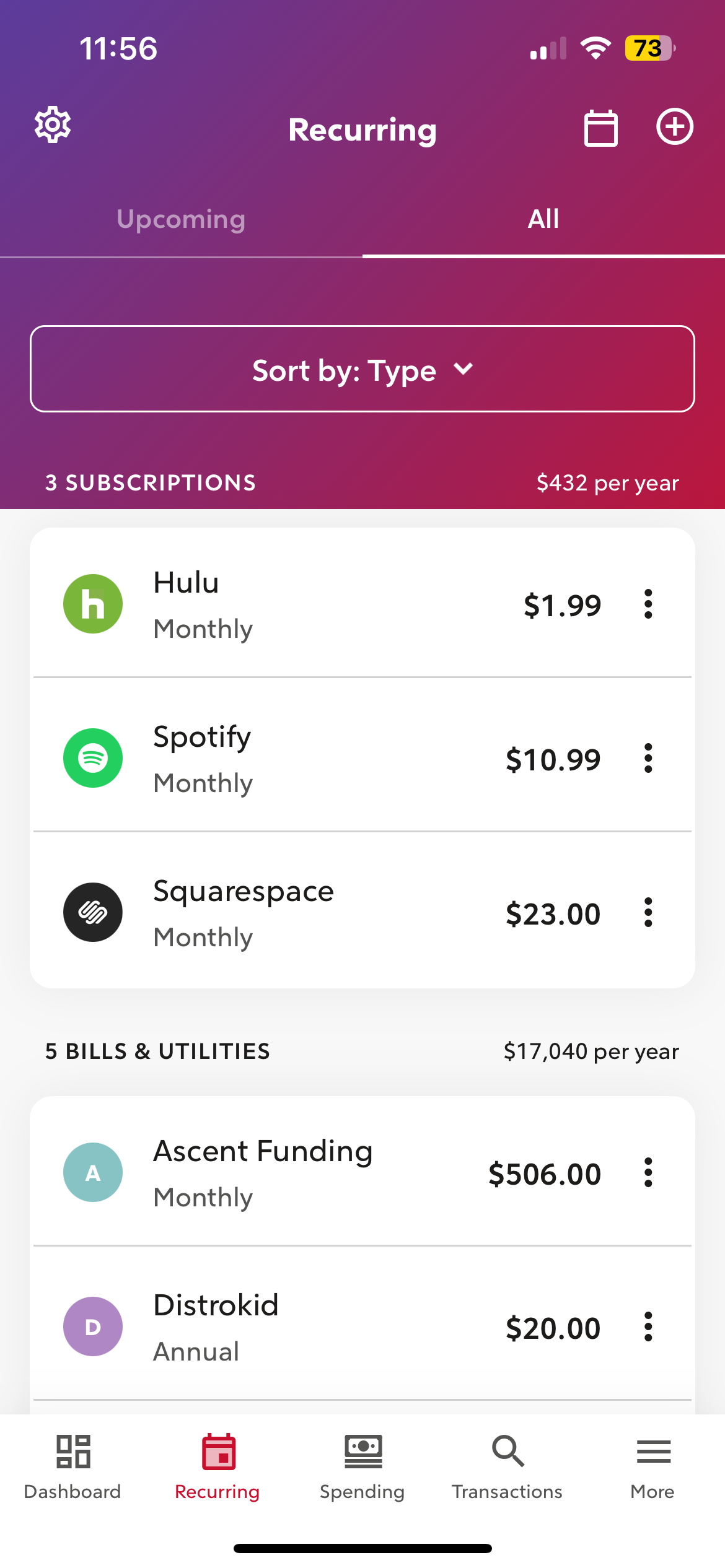
Rocket Money is an app that I actively use, so it was easy to point out both its strengths and weaknesses. In my research, I learned that it was also considered the best overall app for tracking and canceling subscriptions.
Pros:
The app notifies users about upcoming charges.
Users also have the option to see only upcoming subscriptions or all of them, and can cancel a subscription through the app or redirect to the service’s website.
Cons:
The app charges $3 to $12 to upgrade to a premium version.
Some of the app’s layout could be rearranged to make the cancellation process flow better.
Bobby
Bobby is a subscription tracking app that lets you see how much you pay per month, and how often the charge is.
Pros:
The app features a list of subscriptions to apps and services that I’ve never heard of, so their user base must be very global and diverse.
Cons:
The app only keeps track of subscriptions, but doesn’t let you cancel anything.
The app does not send notifications, and adding more subscriptions to your list is locked behind a paywall.
Mint
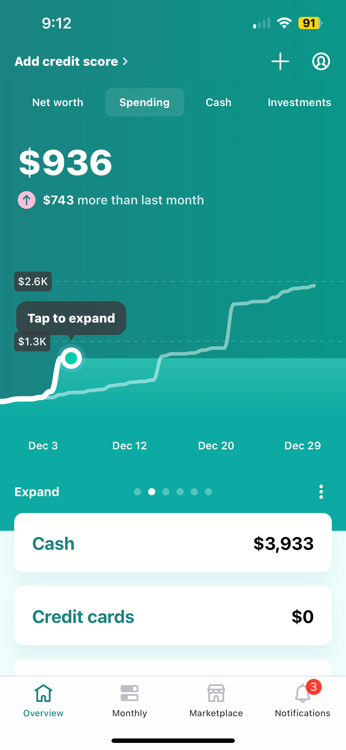
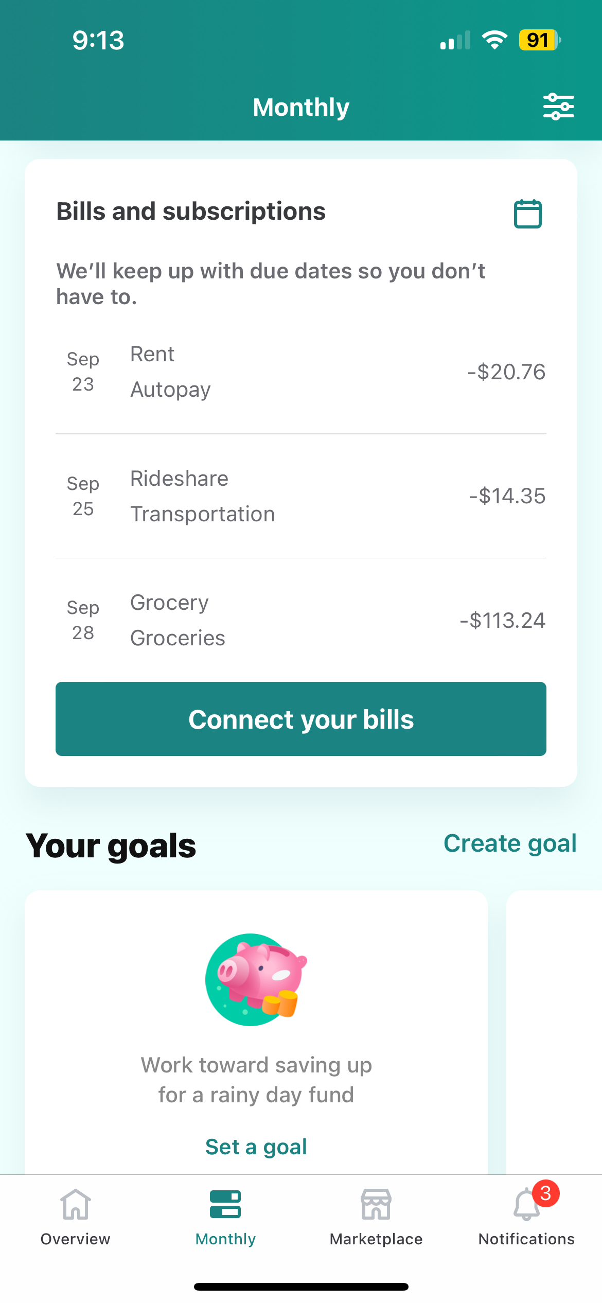
Mint is another subscription tracking app made by the company Intuit, and serves the same function as Rocket Money.
Cons:
You have to scroll halfway down the “Monthly” section before you finally see your subscriptions.
The app had issues connecting to my bank, so even after verifying my account three times, I still couldn’t see my subscriptions.
Pros:
The app has a very nice color palette and gives notifications for upcoming bills.
BRAINSTORMING AND SKETCHING
I did a Crazy 8s exercise and sketched a few screens of a potential user flow. I ended up not using all eight panels since the flow turned out to be pretty short.
Pictured here is my initial flow, where the user starts at the home screen, navigates to subscriptions, checks out the calendar, and cancels a subscription, before checking out a monthly report.
This order ended up changing later once I started creating my screens.
IDEATION
User Flows
I created a user flow using Miro to show all the potential routes that a user would take. Due to time constraints, I skipped the login portion of the flow and went straight into how a user would go about canceling a subscription. The initial flow that I had sketched was simple and straightforward, so naturally the user flow I ended up creating was also simple.
INITIAL LEARNINGS
I then used the “POP by Marvel” app to run guerrilla usability tests, and would have people look at my sketches and pretend to use the app.
From my research, I learned that users wanted a comparison feature, so they could see how much money they were spending month to month on their subscriptions. This lined up well with what I learned from my secondary research.
They would also like to be told which of their subscriptions/apps were being used the least.
DESIGN
Wireframing
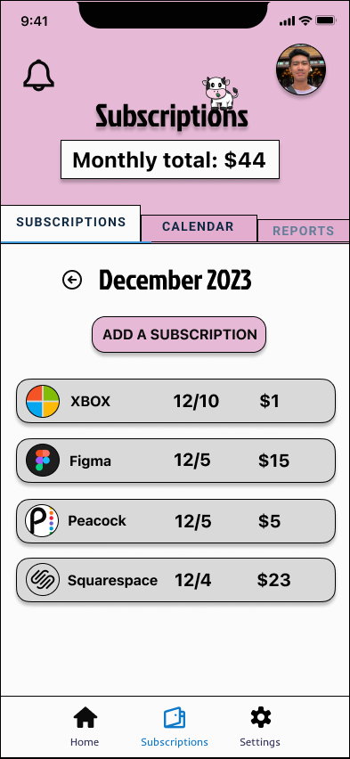
These are two of the initial wireframes for the subscriptions tab and the monthly reports tab. Since the app is called “Moolah”, I went with a cow for the app’s logo.
For the app’s style, I chose pink since it blended in with the background of the cow photo, and green for the in-app notifications to reference money.
TESTING
Usability Testing
Because it was the Christmas season when I was working on this project, my pool of users available for testing ended up being smaller.
I opted to change my range of users from the ages of 20 to 30, to users from the ages of 20 to 60, and this made sense since the intended user base of Moolah is people over 30.
I presented my screens to three users and took notes on their thoughts.
The app overall was considered easy to use, and the cancellation process was straightforward.
A word that was used a lot during tests to describe the app was that it was “useful” (especially the subscriptions tab and the ability to pause a subscription).
Users liked the layout and the feeling of convenience that the app gave.
Users noted that there was dead space on both the home screen and the calendar tab.
HIGH FIDELITY WIREFRAMES
I made some minor changes to my designs and filled up the dead space on a few screens.
TESTING ROUND 2
Users really liked both the subscriptions tab and the calendar tab.
The cancellation page for Squarespace seemed to be universally liked by everyone.
Users said that for an app like this, they would find receiving notifications helpful.
The app was overall described as “straightforward” and “really helpful.”
Users said that they had issues with both the app’s font and colors. It made the app feel too “fun and whimsical,” rather than something more professional for a finance app.
Users would most likely use the Reports tab the least.
FINAL DESIGN CHANGES
Pictured here are my final edits to my screens. I removed the cow logo since it had a pink background, and changed to a more simple color like blue. I also rounded corners in the app to make everything look smoother.
CONCLUSION
This capstone project was actually very challenging for me, as I approached it like a month long design sprint. I needed to learn how to pivot and be flexible, which was important given that I was working on this app during the Christmas season. The amount of time that I spent designing and the types of users that I worked with would change frequently.
From my research, I learned that users wanted to know how much they were spending from month to month, and wanted to be told which of their subscriptions were used the least.
This project was also a great reminder for me design wise, as I needed to remember to choose the appropriate colors for my design, as well as take advantage of the app’s design space.


